Xcode 6 Tutorial Grouped UITableView
<Image alt="Swift Tutorial : Xcode 6 Tutorial Grouped UITableView" objectFit="contain" src="/static/images/xcode1.png" height={350} width={1000} placeholder="blur" quality={100} />
In this blog post we will talk about how to create some of the setting page which we see in almost every application [Settings Page Design] using the new Xcode 6.
Almost all of the above design can be implemented using grouped UITableView.UITableView is one of the basic building block for any iOS application. Almost every app uses UITableView in one or the other form.If you ever wanted to display a list of items, UITableView is your friend.
UITableView has two different style one is plain and the other one is grouped.In this post we will concentrate on the grouped style with static cells.
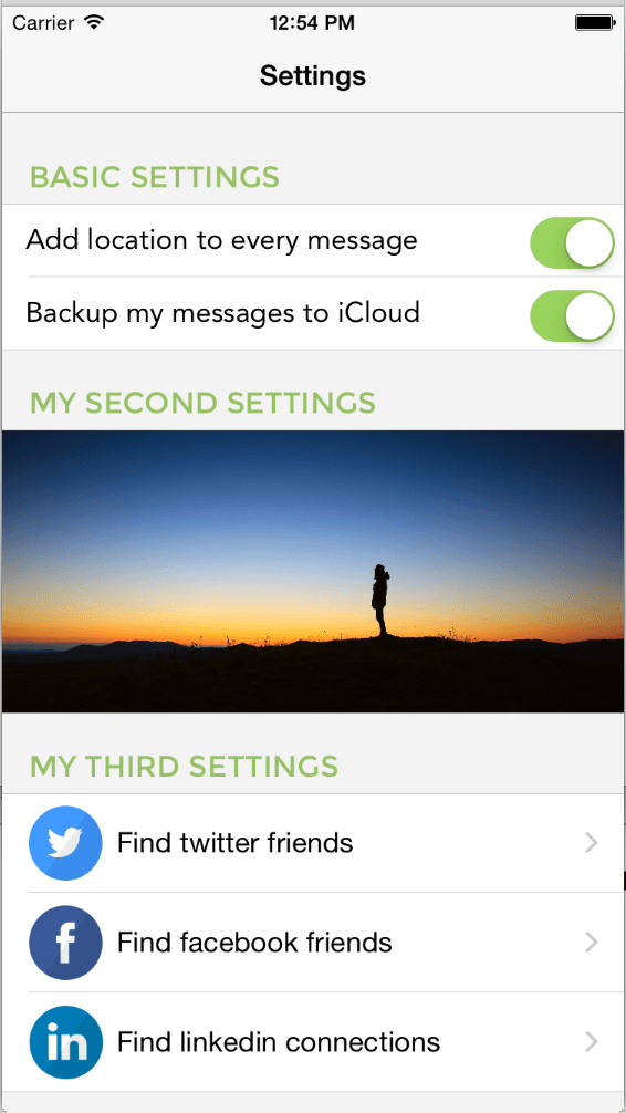
This is the reference setting page which we will be building.
<Image alt="Swift Tutorial : Xcode 6 Tutorial Grouped UITableView" objectFit="contain" src="/static/images/xcode1.png" height={350} width={1000} placeholder="blur" quality={100} />
If you are looking for an implementation of dynamic uitableview, find out more on how to Build Airbnb Discover Page using uitableview and uitableviewcell customization technique otherwise continue.
Steps
-
First drag a UITableViewController on to the main storyboard.
<Image alt="Swift Tutorial : Xcode 6 Tutorial Grouped UITableView" objectFit="contain" src="/static/images/xcode2.png" height={350} width={1000} placeholder="blur" quality={100} />
-
Select the tableview and in the attributed inspector select Content as Static Cells, Number of Sections as 3 and the Style as grouped
<Image alt="Swift Tutorial : Xcode 6 Tutorial Grouped UITableView" objectFit="contain" src="/static/images/xcode3.png" height={350} width={1000} placeholder="blur" quality={100} />
-
Select the individual section and set the number of rows to whatever you want for that section and provide the header. <Image alt="Swift Tutorial : Xcode 6 Tutorial Grouped UITableView" objectFit="contain" src="/static/images/xcode4.png" height={350} width={1000} placeholder="blur" quality={100} />
<Image alt="Swift Tutorial : Xcode 6 Tutorial Grouped UITableView" objectFit="contain" src="/static/images/xcode5.png" height={350} width={1000} placeholder="blur" quality={100} />
- Next drag a uilabel and a switch control from the object library to the first cell and second cell.
- Set the autolayout constraints for both uilabel and the switch control. <Image alt="Swift Tutorial : Xcode 6 Tutorial Grouped UITableView" objectFit="contain" src="/static/images/xcode6.png" height={350} width={1000} placeholder="blur" quality={100} />
CTRL + Drag from the label to the left contentview and select leading space to container marging.
<Image alt="Swift Tutorial : Xcode 6 Tutorial Grouped UITableView" objectFit="contain" src="/static/images/xcode7.png" height={350} width={1000} placeholder="blur" quality={100} />
CTRL + Drag from the uilabel to the right contentview and select trailing space to container margin.
<Image alt="Swift Tutorial : Xcode 6 Tutorial Grouped UITableView" objectFit="contain" src="/static/images/xcode9.png" height={350} width={1000} placeholder="blur" quality={100} />
Perform similar action on second and third section.
- In the second section we would like to add a image to make it more interesting. Increase the height of the cell in the size inspector and drag a uiimageview from object library onto the cell. Select the desired image from your asset library and set the Mode to
Aspect Fill
With the above steps you will be able to get some default settings page. In case you want to customize the look of the setting page you need to extend UITableViewController and override a few of the functions.
In my case I will override the willDisplayHeaderView to change the font and color of the textLabel inside the headerview.
//
//  SettingsTableViewController.swift
//  autolayouts
//
//  Created by Shrikar Archak on 12/25/14.
//  Copyright (c) 2014 Shrikar Archak. All rights reserved.
//

import UIKit

class SettingsTableViewController: UITableViewController, UITableViewDelegate {

    override func viewDidLoad() {
        super.viewDidLoad()
        self.tableView.backgroundColor = UIColor(red: 243.0/255, green: 243.0/255, blue: 243.0/255, alpha: 1)
    }

    override func didReceiveMemoryWarning() {
        super.didReceiveMemoryWarning()
        // Dispose of any resources that can be recreated.
    }

    override func tableView(tableView: UITableView, willDisplayHeaderView view: UIView, forSection section: Int) {
        let headerView = view as UITableViewHeaderFooterView
        headerView.textLabel.textColor = UIColor(red: 151.0/255, green: 193.0/255, blue: 100.0/255, alpha: 1)
        let font = UIFont(name: "Montserrat", size: 18.0)
        headerView.textLabel.font = font!
    }
}
One more thing to note is that the current tableview controller should be made as the initial view controller and also in the main storyboard the custom class for the tableview controller should be set to the new custom class which you created. Please let me know if you have any questions / feedback.
<iframe src="//www.youtube.com/embed/TyFXoG9OZHI" width="420" height="315" frameborder="0" allowfullscreen="allowfullscreen" ></iframe>